Wednesday, 21 October 2015

Marissa Johnson Editing

Today we have been editing our advert and is our deadline to do so. We had edited the previous week however Sherri was the one with the edited footage from the previous week so me and Nathan had to start again luckily it was placed on the C drive and I had the clips on my pen drive. We had to start the skeleton edit again and just put it all nicely back together. A skeleton edit is just inserting the selection footage wanted into the advert sequence using the mark in and mark out keys to select the parts.
Me and Nathan then made all the freaky looking scenes to black and white by using the effect tab and selecting the black and white option and dragging it onto the clips we wanted to have that effect. Once doing that we edited in some dip to white before every scene started for the effect of lighting or the sudden change of location/shot. We included once of the dip to whites just before Sherri changed to looking happy drinking the product so that the clips didn't just go from black and white straight to color because it would of looked odd. We did this by using the effect tab and using the video transitions.

We then included another transition which was dip to black at the end so that the advert faded out into the poster for our product at the ending clip.

We then hit enter and rendered all files and then started with adding our audio. We placed in the first audio selection some spooky ambience music just to get the effect of looking like we were filming in a haunted mansion. We then included lightning just for another dark freaky effect on the audio. I then inserted a sound effect of a squeaky door opening when Sherri opened the door in the advert. In the last audio I placed a footsteps audio but it was out of sync but it made it sound like there was a mysterious dripping tap somewhere making a non diegetic sound input in the advert. Once Sherri was transforming we placed the song 'Paradise' in to make it look like a happy effect and when placing the song onto the audio it made the advert seem quite humorous as it amused me and Nathan with how the song just randomly comes into the advert zooming into the product.
We then exported the footage into a widescreen and normal and then saved it to Marissa's hardrive.

We had then finished and it was uploaded to YouTube.
 https://www.youtube.com/watch?v=H0CDeS5spVI

Monday, 19 October 2015

Mark Epton, Photography Evaluation

In Mark Epton's lesson I managed to produce last minute merging a landscape scenery image into the lenses of some sunglasses. I went out and had the idea of taking a picture of some freaky looking forest/woods as I've seen a lot of locations used for horror films are often abandoned woods. This was what I managed to capture.

I was happy with this image as I thought it included leading lines with the path heading in a forward direction and it also looked slightly freaky with the effect of the autumn role with the shattered leaves on the floor and the mixture of different colored leaves on the trees. The only think I wasn't happy with was the lighting in a way as I wanted this to look dark. This wasn't my plan as I went and took this image in the day time using nothing but natural lighting. I then thought I would just edit the contrast and brightness of the image on photo shop later on when it came to editing the images.

I then went home and took a picture of a pair of sunglasses from the front view and yet again using the effect of natural lighting. I used the idea of what Mark had told me to do previously in lessons and make a seamless background so it is easier to edit/crop on photo shop.

I was happy with this image as it the natural lighting was good and you can see a lot of detail within the image of the sunglasses and you could easily see the lenses in the shot. This took me around 5 shots to get this image as the detail on everyone wasn't as good as this one. This was just a simple image and was perfect for what I needed to do as I wanted a clear shot of the front of the glasses.

For the idea of what I had I didn't really research anything so I didn't have any inspiration from that. However I was messing around previously in a tutorial lesson and I had been on YouTube watching a tutorial for photo shop and it basically shown the viewers how to merge a scenery image into an outline of an animal which has some inspiration towards my photography project. I was then in Marks lesson and I was bored and I remembered the video and I thought to mess around and attempt to put some scenery into some lenses. At this point I had roughly taken images for the project but when I looked at what I had created on photo shop just messing around I got inspiration to use it for the project. It came in handy as it would help me with my evaluation as for the first image I didn't really know what I could write about as Mark had helped me and gave me instructions on what to do last minute and I didn't really understand so I decided to change my image. This was what I had took previously using the ghostly effect with something to do with the shutter speed. I did like this image but I just couldn't think of what to write about in the evaluation.


This was the image I created on photo shop which gave me inspiration to do what I wanted to do for the photography image.


After taking the images I went and merged the two of my images together to get it looking like what I had created before and this was my outcome.


I had edited the scenery image into the lenses like I was wanting to do. I had to use the lasso tool and quick selection tool to crop out the sunglasses from a front view  and then use the same tools to select the lenses and then delete them from the image so you could see the forest through them. Making it look like in the reflection of the glasses was the forest. I had edited the forest images brightness and contrasts to make the image look darker and freakier than the original which you can clearly see on the left lens with the change of brightness. I then had to erase all of the rest of the image so that all you can see is the forest in the lenses and not surrounding the glasses.
I feel happy with the outcome although if I was to do it again I would have tried to find a way to make the bottom of the sunglasses look less blodgy so that you cant tell the sunglasses was ever cut out because you can see that I have cropped it as there is little chunks missing from the glasses. In order to take the action to improve I would research more ways to crop efficiently or any ways to crop more efficiently.  I also would have taken both images with a better camera as I had to take them on my I phone so the quality could have been better with the images but they do look decent and they aren't too bad and wasn't a big issue. As I said I am happy with the outcome apart from the problems mentioned as side and I know what I could have done to improve further.

Owain Davis, Poster Evaluation

In the lessons with Owain Davis I produced a poster for the end of my groups video advert which was included in our footage.


For the making of this poster I didn't necessarily research anything. I created this poster during one of Faye's lessons for catching up. I looked on moodle at what I needed to include on the poster and I then thought to put this together. I thought that the most important thing for the poster would be the background and making it eye catching and some how can relate to the product. I thought that because the flavor of the product we used was orange I would make the background oranges to reassemble what flavor the product is. I then thought that it was a good idea as orange is a bright color and it sticks out well. I liked my choice for this. I pasted it onto Photoshop and then thought about the next step which was how to include the product on the poster. I then remembered back to previous lessons where I was messing around on Photo shop and I was attempting to get the scream character to hold the product and I got inspiration to try again. I then applied this idea to the poster and I managed to get the character to hold it. In order to do this I had to first of all print screen of adobe premiere when Nathan had recorded the drink as we never took an original image. I then cut the drink out using the lasso and quick selection tool and just for now copied and pasted the selection onto the poster. I then went onto cutting out the scream character with the same process and pasted it onto the poster. I then had to move it around and I then figured that to make it more effective I need to try and get it to look like the character is gripping onto it. I then had to crop the scream character again but this time just crop the fingers out and place them near the drink. I then went onto choosing fonts and choosing what color to make it stand out and I chose grey to make the poster advert slightly dark but not too much and I used the same font and color for the quote and edited it underneath. I then thought I didn't want to have the text in a straight line and right underneath each other so I inserted the top of a fanta bottle after the quote. I cut out more than half of the drink on photo shop as I had to get it looking like our product and without the 'Fanta' label being on the poster. The last step I included was the jigsaw character from saw onto the letter O. I got inspired and thought to edit the text a little so it wasn't just boring text and I thought that I needed to stick to the same freak or unique theme so I thought to edit a mask onto the letter O. I was going to think futher into what I could do to edit the other letters but at that moment in time I couldn't think and it was close to the end of the lesson and I was happy with the outcome of what I had produced.
I learnt the skills of cropping more efficiently by using both the lasso and quick selection tool together as I didn't know I could do that. I learnt how to copy and paste from one tab to another. I learnt how to in general what is needed to create the poster. I think the only thing i'm missing is the logo on the drink but I could not access it on the day as Nathan wasn't in. I had created my own but it wasn't the same as what we used for the product.
I am overall happy with the outcome of the poster and my group also liked it and picked it to be included in the video advert.
If I could improve I would include the logo and some more information which I saw on moodle but I wasn't sure what to include.

Friday, 16 October 2015

Mark Epton, Final Photography Proposal (Including My Own Merged Images)

My idea for my freaky image was inspired by something I had seen on YouTube. I was watching a tutorial for photo shop on YouTube and the person had managed to have an animal shape outline and inside was a faded scenery and it looked good. I had watched this video a few weeks before and In Marks lesson I took an image and written a proposal that is also on blogger before I wrote this. I then got bored in lesson after I had written that first proposal and I then went onto photo shop to attempt to do what I had seen on the video. I managed to merge a freaky looking background into a pair of sunglasses lenses and I really liked the look of it and thought it looked way more creative than the first image even though shooting that image required a lot more knowledge on using the camera. The image I was wanting to do involved more photo shop knowledge than camera skills.
This was the image I produced whilst messing around on photo shop.

I then thought id go away and take a landscape picture of a forest/woods and then eventually when I put it onto photo shop I would mess around with it and change the brightness and contrast to make the dark freaky forest effect. I then knew I could get hold of some sunglasses or something with a lense or some kind of object that has a part where it is transparent and I would just take a picture of that. I then thought to use Marks advice and I would take the picture of sunglasses using a white piece of paper to make a seamless background so it is easier for me to photo shop in the long run.
I am writing this proposal after I have merged the two together so I will leave the original photograph's I taken and then below those images the final edit which will also be blogged onto another post for Mark to access a lot easier and quicker.

Here is the final edit of the combination of both the images I taken.


Week 5, Mark Epton, 16/10/15

Memory check

1. What is ISO and what does it effect?
- Iso is the setting to adjust the camera sensitivity to light.

2. When would we use the ‘P’ control setting on the camera mode dial.
- To control the shutter speed and aperture.

3. Name two important consideration when attaching the tripod baseplate to the bottom of camera?

4. Name three important considerations when using a red-head lighting kit
- Don't touch the barn door and let it cool down before packing away

5. When focusing the camera, what do we place on the object/subject to ensure it is the center of focus?
- Triangle


6. Name two techniques we can use to adjust the brightness and contrast of a photograph ?

Mark Epton, 1st Try Photography Proposal

I wrote this up on word earlier but I then decided I could do better than this idea so I changed my mind and decided to take 2 pictures and merge them together. I went out and took some shots. I decided to change my mind as I was bored in lesson I started to mess around on photo shop attempting to try and do something I had seen on YouTube. I then looked at it once I had edited it and decided that it was a better idea for my photography freaky image first assignment. I was okay with my first image because it looked good but I figured that I couldn't really write much about what I did to produce the image in my evaluation. This is because I didn't really understand what Mark was saying about the settings on the camera dial and shutter speed etc. This was the first proposal I wrote and the image. 


Owain Davis, Product label for advert

This is the product label for the advert video production lessons. I wasn't here in the lesson the class was all creating them so i didn't exactly know what the correct measurements where or any detail like that so i decided to deal with that problem by finding a template on google and using it and editing futher to make a label. Even though i wasn't there and didn't know what measurements was needed i thought that attempting to create one would be better than leaving it and not doing anything.


  • I made this label by first of finding a water bottle label template on google and using it to get a ideal measurement of what a label should look like.
  • I then had to paste it onto Photoshop, enlarge the image and crop all of the text around it off so i was just left with the template.
  • I then used the gradient tool and covered it up so that all the text within the template had disappeared so i was left with a plain white background on the label. 
  • I then went onto google and i thought that id try and find an orange pattern to use for the background image as the product we used for our advert was orange flavored so i thought i could try and make the label look more effective and try and set the theme with the flavor. All i then had to do was stretch the image to make it fit onto the template.
  • I then went onto google and found the scream character i had been using previously on photo shop to create the poster and pasted it into another tab on photo shop. I then used the quick selection tool and cut around the character and cut out the background. I then held 'Ctrl + C' to copy my selection and pasted it onto the first tab and put it into the corner.
  • After i did this i went onto the da font website and selected the font i have used. I print screened that and pasted that onto another tab in photoshop. I then cropped out all of the parts i didnt need and used the same method with the quick selection tool and copying and pasting. I then had to move the layers around so that the text covered up the scream characters hand.
  • Lastly i then found a picture of an orange and used the same method and then pasted it onto the label. I had to again move the layers round so that the text was on top of the orange.

Mark Epton, Freaky photo's


Wednesday, 14 October 2015

Marissa Johnson, Video Advert Evaluation.

In the video production lessons, Marissa set the class task of making a video advert. We was placed into groups of 3 and in our groups we had to come up with a product to sell in our advert, what roles we would need to consider for everyone part taking in the group for us all to be involved, director, editor, main actor's, etc. What locations can be used in the making of filming the advert, what music or would there be any voice overs involved, would we be using any diegetic sounds or non diegetic sounds, if we was using a background song with minor or major keys, what the tempo is going to be like and what prop's we could bring in to film.
I was placed with Sherri and Nathan in my advert video production group. The first week when we was issued to start planning for it, it was only me and Sherri in that week so we both introduced our self s to each other and started to discuss a few ideas and came up with 2 so we jotted them down. We also came to a quick decision of choosing what our advert should sell. We chose a drink product so we then started to watch some YouTube video's on commercials, specifically drink commercials, and looked for inspiration for an idea. We then thought it would be a good idea to re act the snickers advert but only with our freaky/unique input. We roughly planned out together that we shall shoot our video advert on a staircase, that Nathan should be the main actor, Sherri would be filming the types of shots for the scene's and would be involved with acting if she was needed and I then agreed that I would do the editing for our group and I also would be involved with acting if necessary. We then decided a rough idea of what we was going to film.
The next lesson for our video advert production was difficult, as both Sherri and Nathan were not there. So I had to work alone. In this lesson I looked back at my notes that me and Sherri discussed and was able to write a proposal for our group. Mine and Sherri's first idea was to start of at the bottom of the staircase filming Nathan chasing me up the stairs, whilst I was carrying the drink with Nathan looking angry in props and it would then escalated to where I would trip and for him to take the product of me and to drink it, and then he would change from looking angry to looking happy and him dressed without props. I then decided that it wouldn't have been very safe if anything was to go wrong. I then decided that Nathan would just start of by looking angry/out of place dressed in props
and would then escalate to him finding me or Sherri and we would hand him the drink, sticking to mine and Sherri's idea of the drink transforming him to a much better person, making the drink look like it has a positive impact on whoever drinks it to grab the audiences attention. I then went out and looked at the location me and Sherri talked about and filled in a REECE form which was needed to make sure it was suitable to film in. After this I then started making a rough storyboard and shot list which was then edited just before me, Sherri and Nathan went to film as it wasn't the best.
For Nathan's absence he made up with making our product label that we used for filming and also came up with our slogan "The hottest cold drink".
Luckily the week we was all set for filming our advert all of our group members where there. Nathan on the day of filming forgot to bring the props but luckily we worked around this situation and could easily go out and buy one. Before actually filming we edited the shot list as it didn't have a variety of different shots involved and we also edited the storyboard again so that it was easy for all of us to understand. We then all signed the health and safety sheet and then went off to film at a location. The location we filmed at however wasn't the location me and Sherri talked about or what I filled in the REECE sheet for. As we then attempted to film we all then switched roles. I became involved with the directing of the advert and appeared in our advert for the second actor. Sherri became main actor and Nathan became the person who filmed. Everything we planned in the beginning had changed massively but we all coped around the changes.
When me and Sherri watched the clips back we wasn't impressed with our outcome but we then said we would leave it and just see if we could edit it to make it look alright. I went home and did some homework and designed our final poster that we was going to use for the end of the advert and Sherri thought it was very good and was impressed with it.
After all of this Nathan was not here the week we started editing so me and Sherri worked to our best and managed to edit the clips to something we was happy with.

In conclusion we managed to produce the 15-30 second advert with a numerous amount of changes and absences within the group. The skills I have learnt is to manage to cope with changes and stay positive with resolving problems around the changes. I have also learnt how to work within a group alot better and get involved with things. I have learnt how to edit special Fx's into the advert when we was editing the clips and also what a skeleton edit is. I have learnt how to be more flexible and felt like the time keeping of the project was something we all managed to cope with a lot better. Within the short amount of time, we all had absences within the group and still managed to produce the same amount as everyone else who had groups with full attendance. Overall I feel good with what our groups advert outcome was even with our disadvantages to the other groups within the class. If we were to do things differently within the project I think our group would improve on attendance so that we can all plan things together so its not one case of 1 person being there and then the next all of us being there. I think we would of also planned more into depth of detail for our advert as when we got to filming it was just like we had done it without scripting and without any planning at all as everything changed when we was filming. I also think we would improve by instead of sticking to one idea but to make another for like a back up plan if anything was to have gone wrong or not to plan for example when Nathan forgot the prop it could have been a case of we wouldn't of been able to do anything as the whole plan would have been useless for us as the prop was a main element of the advert, however we was just lucky that there was some shops in range of distance from the college. 

Monday, 12 October 2015

Owain Davis, Draft of product poster for magazine advert & Label for product!


I will now explain how i managed to make this! This is the poster that doesn't include the product logo on as at this point i have not yet edited the logo for the product. There will be an updated upload of this image below once i have done that.
The steps i did in order to create this image are:

  • Firstly I selected this picture of multiple images oranges to set as the poster background.
  • I then opened another tab on Photoshop and opened up a previous image that I had recently worked on in lesson and i used part of that image and inserted it onto this magazine poster. To do so I used the lasso tool and roughly went round the edge of the scream character holding the drink and I then made it more efficient and used the quick selection tool to get an accurate cut round and I inserted it into the bottom right corner.
  • I then used the text tool and then chose the hobo std font and typed in the headline/ product name and placed it at the top.
  • I then thought I could make it look a lot freakier and i decided to open another tab and paste a jigsaw mask image. I then used the quick selection tool to cut around the head and then I held 'Ctrl + C' and copied my selection onto the poster and decided to place it into the 'O'
  • I then used the text tool again using the same font but different size to insert the slogan onto the poster.
  • Lastly i then opened another tab and cut out the top of a fanta bottle and used the same techniques with quick selection tool and copy and paste. I then pasted it onto the poster and put it at the end of the slogan because i thought it looked good and it is also showing a sneak preview of the product again.


Marrisa Johnson.

Rough sketch of storyboards & Type of shots.

This is the rough copy of the types of shots that are being used in my groups advert that was created on story board it. This version was altered on paper with Marissa as not everyone in the group 100% understood how we was going to shoot the shots for the clips. This however was the first version of the shot list online. I did both of these online and then sent them to our group. (Sherry & Nathan)


Wednesday, 7 October 2015

Owain Davis, Lesson 4, 10/07/15 -

Today we have been editing on photoshop. I have taken the product and have been making a picture for a magazine using the product and different techniques to make the picture of the product look more freaky and abit more detailed. Instead of keeping the original image simple and bland.
This was the image I managed to produce in the first lesson.


  • For this image I had to print screen the image from the video clips we produced in Marissa's lesson and i had to paste that on word.
  • I then had to crop the image so I got the background I wanted without any of adobe premier editing software on the image.
  • I then saved the image and opened it with photoshop.
  • I then decided I wanted to create a 3D effect for the bottle so for this I had to duplicate the original image and then go onto the duplicate. I then left clicked and clicked on blending options and un selected the 'G' & 'B' box and left the 'R' box selected so that this image is now red.
  • I then duplicated the image I had just edited and then I clicked on blending options again. This time I un selected the 'R' box and re selected the 'G' & 'B' box. This then made the image turquoise.
  • I then clicked on the layer that the image was red on and I then held 'Ctrl' and then moved the image by using the arrow keys this then moved the red image.
  • I then clicked on the layer that the image was turquoise on and applied the same technique. The only thing i did different was change the direction I moved this image to create the 3D effect.
  • I then opened a new image, which is the second bottle on the left. This took me to a brand new page.
  • I then selected the lasso tool and chose which parts of the image i wanted and cut out the background of that image and altered the selection with the quick selection tool.
  • Once the selected parts of the image I wanted was highlighted I held 'Ctrl + C' to copy the image. I then went back onto the first image i had been editing and pasted the second bottle onto the original.
  • I then held shift and clicked on all layers and linked them together so that they couldnt be altered as i was happy with what i produced and saved it as a Jpeg and closed down the project on Photoshop.
I then went on further and started editing this image throughout break into the second lesson. I needed to make the image a little freaky so i decided to add the Scream image in and i also found it more effective to get the Scream holding the product.


  • For this image I opened up the Jpeg I had just saved so the previous image i had edited was the background.
  • I then opened the bottle image on a different tab on photoshop and used the lasso and quick selection tool to cut out the bottle again.
  • I then held 'Ctrl + C' and copied the bottle and then pasted onto the first tab with the background image.
  • I then opened another tab and found the scream image on google and pasted that onto the tab. I then used the lasso and quick selection tool again and cropped the scream out. I then copied and pasted this onto the background image with the same techniques used before.
  • I then had to paste another scream image onto another tab to then cut out the fingers so i could create the effect of the scream holding the product. I used yet again the lasso and quick selection tool and then copied and pasted onto the first tab.
  • I then just moved it all around and got the image to look like the scream character was holding the product, Just like I wanted
I learnt independently how to efficiently open another image onto a different tab and then copy that image onto the first tab.
I have learnt how to crop more efficiently by using both the lasso and quick selection tool combined.
I then went on and started my evaluation on the image i have created on word.
I still need to edit my image onto a magazine and also add the slogan onto the image which shouldn't take me long.
 

Tuesday, 6 October 2015

Marrisa Johnson, Lesson 4, 06/10/15 -

Notes on filming.

In today's lesson we was asked to do an overall review of what we had been planning previously for group advert. We signed a health and safety form each to ensure we wasn't doing anything out of proportion in our advert. We then had to re look at our storyboard and look at different shots for our film and we then filmed with Marissa's advice on different shot types. We then went out and shot our footage that included mid shots, wide shots, extreme close ups and close ups. We didn't take a microphone out as we didn't want sound in the advert and music only. We shot each clip 3 times to give more of an option for when it came to editing. We then came back into lesson and started editing our clips. We all did a skeleton edit of the clips to just put them in order so its easier to edit next week. I then messed around with footage that wasn't needed and tried out some different transitions and effects on clips. I learnt how to save footage to the computer and save the whole project as one.

Monday, 5 October 2015


Mark Epton, 25/09/15

Annotated composition rules & Research

I looked into a national geographic booklet and looked on google and took/saved the images of the types of photography shots I could find.


Rule of 3rd Image -


Balancing Elements Image-


Leading lines Image-


Symmetry and pattern-


Viewpoint-


Background-


Depth-


Framing-


Crop-

I then researched 10 freaky merged images on google and explained why they grabbed my interest or what appealed to me when i saw the image. The images and text is written down below.


 1. Penguin merged with whale.
This grabbed my attention as it looks really real and that is has been edited by someone who is very fond of photoshop and knows what they're doing. It caught my attention as it looks funny and its just brilliantly merged together with how whales and penguins are the same color and its just overall very well merged together.
2. Puppy merged with bird.
This caught my attention as its very goodly merged together and looks very realistic in a way. I like the way they're very goodly edited together. Its a very perpendicular image and would make a person look twice.
3. Pug merged with gorilla.
This caught my attention as i found it very amusing and its edited together good! I like how whoever edited the image took into consideration that gorilla's and this pug have the same color fur so that it looks more effective how they're merged together.
4. Monkey merged with parrot.
This caught my attention with how amusing this looks and in general is an interesting image to look at. I like how the image has combined a land animal with a air bound animal. I find that very interesting at how the person came to deciding these images together.
5. Horse merged with duck.
I find this yet again amusing with how the choice of animals was decided to combine. I can see why it was an easy choice with how both animals can be white and it can be easily merged together into 1. I like this image as its weird to look at with how the horse can be known as a pet and are not often wild animals with a duck which is more than likely to be a free land animal. Also the fact the animals live in different habitats such as a horse usually lives in fields or a barn and a duck usually lives by a pond or any sort of location with water located near the area.
 6. Bear merged with woods.
This caught my attention with how the animal and its habitat has been combined together and it looks very interesting. I like how the woods is shaped into the bear and the bear is still very visable even with the habitat effect inside it. I also choice this image as i would like to learn how to do this on photoshop in the future.
7. Shoe merged with human
This caught my attention with how an object has been given a face/ facial features which would then enable this object to have senses. The person who has created this has used personification with the object and given it accessibility to breathe, etc. This picture makes me feel like there is a hidden message behind this image that only the editer knows about. That could be one point at why they did it or the fact they just found it amusing to combined the two of them.
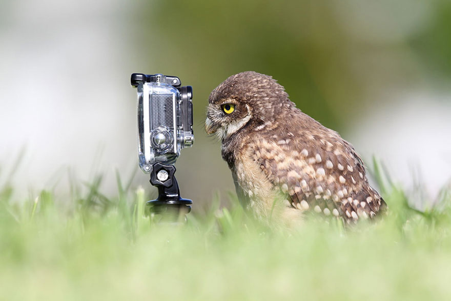
8. Owl merged with a Go Pro
This caught my attention as a go pro is a wide angled camera/video camera that can record wide angled shots. An owl is known to also have wide angled vision so the fact that someone has combined the two of them is very intelligent. This picture makes me think that even thought this Go Pro has special features to make humans record what an owl can usually see but as the owl is looking through it, it has no effect on what the owl can see an owl can usually see what can be seen with the feature on the go pro. This picture also makes me think of that the owl is looking through his own world.
9. Human merged with pug
This caught my attention as its very amusing and looks strangely realistic and is also eye catching. This type of image makes a person look twice as its amusing and was photo shopped for humor reasons only.
10. Guinea pig merged with stapler.
This caught my attention as they have combined an unrealistic combination together. I like how the effect looks almost realistic with how the animal is opening its mouth and you can see inside that iys a office object. I also like the use of effect that has been used with how it looks like someone has drew it to combine them together.

They was 10 freaky/ unusual images that i found of google and reviewed all about them and just explained why i chose them images and what effect the image had on me and what i like about how the images have been put together. 
Library Induction - 30/09/15

During this lesson we was asked to go down to the library to learn how to use the printers and explaining what we need to know to work them and where they are located. We then was asked to look around and find a book that interests you and to take a picture of it. This was the photograph I decided to take a picture of in the library.

I chose to take a picture of this book as I enjoy watching different films in my spare time so i thought id take a picture of this as its based on many different films, different genres and about loads of popular films that has been made ever and in the book possibly has a section about the film itself on each page
Faye Jackson, Lesson 4, 05/10/15 -

Today we have been doing an overview of planning towards the advert making. I have finished writing up and sorting out the shot list for our advert and it has been printed out. I have also edited the storyboard and Nathan has come up with a name for our drink product. Today's lesson has just been a catch up and more of a planning lesson towards our advert. Most things had already been done and all we needed to do was print them out to go with the rest of the worksheets.
I then went down to the library in the second half of the lesson and went and took a picture of a book to catch up with tutorials work. Read blog named 'tutorial, 30/09/15' to read about the catch up work.

I then went onto Photoshop to extend my skills further with editing which will help me with catching up with Mark Eptons lessons that i will soon be doing once i have taken pictures of 10 different products with a white background using the natural light beam into the photograph whilst its being taken for the best effect and then editing them all with better backgrounds.

Tuesday, 29 September 2015

Marrisa Johnson, Lesson 3, 29/09/15-

Advert proposal including REECE.

Today we started of the lesson with looking at adverts and answering the bullet points on a worksheet.
We looked at 3 adverts; Cadbury's, Lynx and Tango.
We evaluated each of them and tried to look for inspiration for the advert our group is going to create. We then researched some more adverts and tried to look for further inspiration for what the advert we are producing about the product we are trying to sell.
I then brainstormed some notes about what is needed in the advert for example, no formal dialogue as we are trying to show the product and not tell about the product and that we have to keep it simple.
I then filled out a sheet that explains about our 15-30 second video and it explains everything needed to know about the advert and what is going to be happening. I then went out and looked at location and filled in a sheet that will be below. Then Marissa introduced story boards for our advert and I started to creat a rough idea of what is going of in every shot.

Write up of advert proposal on word-


The image being used for the location of where the advert is being filmed.


Images of worksheets below-